ADOBE IDEA KIT: Make a (TYPE) Statement

In the Idea kit, Project 7, I created several Type Statements. The tools I needed were the Food Symbol LIbrary, Decorative Objects, Decorative Banners and Seals, and the Brush Libraries. This lesson taght how to add fun text into into symbols and shapes. It also showed how change the text style, color, and shape. In the shell i inserted text into a spirl around the shell. Then i changed the color and shape of the text. I then created my own gradient to create the shell fill.
LAYER FISH
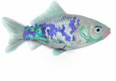
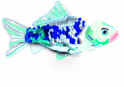
Our latest project was to make a fish using Adobe Illustrator. In this project we put all elements of our fish in the layers tool of Illustrator. Using Illustrator you can control what you see of the design, what you’re working on, and control the development of the project. In my fish I used the layers: eye, fins, scales, filler, and gills. This project took a lot of time because each individual scale had to be drawn out and filled. I to take time to make it seem like the scales were realistic. To draw the scales I used the pencil tool which allows you to go back and adjust the shape after it is drawn. I also you used the pencil to trace a template of a fish to create my fish. To color the fish I used the swatch library in Illustrator. This allowed a different look for the fish instead of everyday colors. Included are my finished fish and then my fish with the template underneath.
Face mask: Development 1
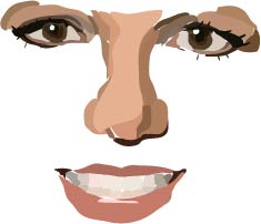
This is the beginning process of the face mask. I was given Britney Spears as my celebrity. Using Adobe templates, other tools, and different swatches I am recreating her face. This is the first stage of her face. So far i finished my eye template and began to work on the mouth and nose templates. To finish the face I will have to fill in the open spaces, add skin, hair, and her accessory. In a few days i will post a picture of the next developmental stage.
Face Mask Final Development.
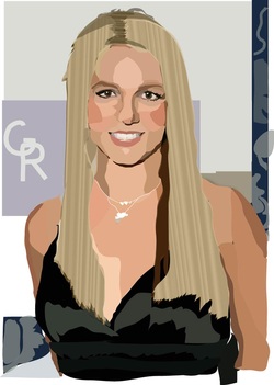
This is my finished piece of the Britney Spears face mask. I was able to finish her cheeks, forhead, hair clothes, accessories, and skin. Using the layers tab I began to work on her cheeks, in the facial feautres layer. I experimented her skin color with the eyedropper to come with a realistic look. The layers feature allowed me to experiement with the arrangement of her features and which skin colors would be behind others. For example I made the background layer the final layer, so anything I placed in that layer would be behind the other layers. I also use d the pencil tool to create the shapes and edit them and the fill features. Using the swatch library I fuond a skin tone that i used behind the other layers to fill any open spaces I did not cover. My final piece is now a realistic picture but also gives off a created effect.
My Face Mask development
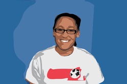
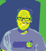
After finishing our celebrity faces our class began to make faces with our own pictures. To do this we took pictures of ourselves and then saved them in Photoshop. In Phototshop we changed the picture size and the amount of colors the picture showed. I put my photo at 13 colors, doing this gave the image a animated look. After that I separated my photo into different layers. Using the same technique I used for Britney Spears, I drew around the colors with the pencil tool. I then used the swatch library in Adobe Illustrator to color my face. Eventually I finished with a very simple image.
Andy Warhol Effect.
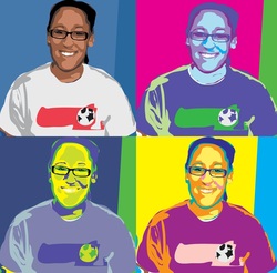
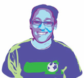
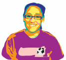
After finishing my face portrait, I began to change the color scheme of my photo so that I had a progression of color changes in four images. In doing this I made portraits of myself that were similar to the art by Andy Warhol. To change the colors of my other images, I took the original image and changed all the shapes that had the same color. This process was similar to block printing but on computer. I then put all four pictures onto one page to finish the design. To do this process I used the same techinque of layers, the pencil tool, and the swatch library. Below are my individual images.
Logo Introduction
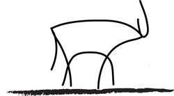
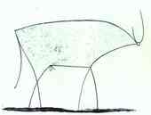
We will be beginning logo design soon in class, so to introduce how to create a logo we took a look at Picasso's "The Bull". In this piece he uses a process to simplify the bull through several stages. So in class we took his picture and simplified it more so the lines were smoother and there weren't as many. I used layers, the pencil tool, and the smoothing tool. I started with a template layer of "The Bull" then I opened a new layer and traced my own version of the bull. After finishing that I went over the lines with the smooth tool to create a easy, simple look. I finished the piece with a brush stroke to create a shafow underneath the piece . Below is a picture of his original piece.
Purple Hopper Productions
To continue designing logos i took Mr. Adams oroginal logo of a grasshopper and changed it to something the "company could use later on. The bottom grasshopper is the original and mine is on top. The symbol changes shwo the evolutions of logos as time progresses and the market, consumers, and products develope. New logos can attract cusotmers to a new buinesses of a classic business that is modernizing. A logo is the identity of teh company and changing the logo is a crucial move for the business. Changing the logo of the "purple hopper" to mie would make the company more edgey and artistic then before.
Somerset-Berkley Raider Logo
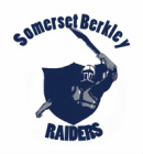
In the past few years there has been great controversey over the Raider logo. At first it was outdated, then it moved to be a copy of another school's, now the has too many elements. So we weere assigned to ercreate the logo if we had a chance to make it what ever we wanted. Fo my design i wanted to focus on the key elements of a raider: himself, his sword, and shield. I left ehe original shield/badge of the logo. and then i changed the shape of the sword. I also removed many of the colors and simplified the logo to 3 colors. In my redisgn process i removed the "Somerset Berkley Raiders" banner. Instead I put the shcool name and mascot as arches surrounding the picture.
Holy Name School Wine Testing.
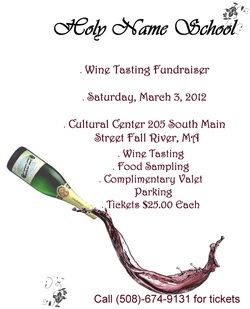
Once again we have been ask to create a flyer for the Holy Name School. For this assignment we had to advertise an upcoming wine tasting. For my flyer I tried to create a simple elegant ad. I focused on the school name and Event info as the most importnat parts. I edited a picture of a water splashing and made it resemble wine pouring. I then added a bottle to look like the wine was pouring from it. My goal was to create a fubn but dynamic picture. In the process of uploading my image the ad was distorted and not accurate of the placement of details.
