Thayer Street Map
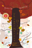
After visiting Thayer Street I was inspired by the areas campus life, park-like presence, and artistic feel. Since there is such a high college influence on Thayer St I wanted to make a map that reflected this influence. I thought about how trees are very historical, like the colleges, and organic like the art inspired by the people. So my map is designed to be a tree. The streets around Thayer are branches, and the leaves are dining attractions in Thayer.
To make my map I used tools like direction select tool, the twirl tool, the pen tool, and the type on a vertical path tool. The direct selection tool was used to correct the arches I made with the pen tool. I used those two tools to trace my leaves, from the Adobe symbol selection. I direct selected parts of the leaves to create colors I wanted of the leaves. I used the twirl tool to create my swirly background, which I think adds an artistic element to my map, and symbolizes the autumn breeze. I found it difficult to find space in my map, and create font that could be seen on my map. Typing on a path also was quite difficult, and keeping my layers organized. The unconventional aspect, and theme of my map is its best feature. If I could change my map I would make it neater, more simple, and clean. I feel ilke my map is cluttered, difficult to see, and not harmonious, I feel as thought these changes would add to my map's overall design.
To make my map I used tools like direction select tool, the twirl tool, the pen tool, and the type on a vertical path tool. The direct selection tool was used to correct the arches I made with the pen tool. I used those two tools to trace my leaves, from the Adobe symbol selection. I direct selected parts of the leaves to create colors I wanted of the leaves. I used the twirl tool to create my swirly background, which I think adds an artistic element to my map, and symbolizes the autumn breeze. I found it difficult to find space in my map, and create font that could be seen on my map. Typing on a path also was quite difficult, and keeping my layers organized. The unconventional aspect, and theme of my map is its best feature. If I could change my map I would make it neater, more simple, and clean. I feel ilke my map is cluttered, difficult to see, and not harmonious, I feel as thought these changes would add to my map's overall design.
Mowgan's Maple Syrup
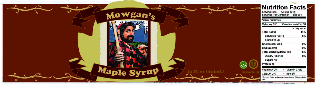
After having Waffle Day our class project was to design our own labels.To create my syrup label I used Photoshop and Adobe Illustrator. After sketching out a rough draft for my label, I scanned it into Adobe, which allowed me to create this label. The tools I used were: the pen tool, brushes, direct-selection tool, and various others. Photoshop gave me the tools, to take Hannah's photo and give it a rustic look. I noticed that most syrup labels have a more traditional look, and using the Photoshop filters, gave my edited photo that look. I edited the photos, by cloning Hannah's face onto a lumberjack's body. I then added a mountain range background, to give the whole piece a more New England look.
Waffle Process
Input: 2 cups of waffle mix (Bisquick), 1 1/3 cups of milk, 2 tbs of vegetable oil, and 1 egg
Bowl, measuring cup, mixing spoon, and a waffle maker
Butter, syrup, knives, fork, napkins
Output: Many delicious waffles
Process:
1. Turn on and preheat the waffle maker
2. Place Bisquick mix in a bowl
3. Add to the Bisquick mix-1 1/3 cups of milk, 2 tbs of vegetable oil, and the 1 egg.
4. Stir these ingredients until the mixture has no clumps of waffle mix, and is blended. Try to not over-mix the batter.
5. Pour the batter into the heated waffle makers.
6. Leave the batter in for about 3-5minutes, but check to make sure waffle is not burning.
7. Remove the waffle from the waffle maker, allow
8. Enjoy!
Feedback:
Everyone wanted more waffles, and were quite satisfied. Sometimes the waffles can be burnt or not cooked enough, but ours were great the only problem was that there were not enough waffles.
Ai presentation
Graphics can lead to careers like
Packaging designer
Logo designer
Advertising
Helping in Magazines
Animation Graphics
Sports Graphics
Drawing for video games
Animations for presentations
Interior design
Product Design
Packaging designer
Logo designer
Advertising
Helping in Magazines
Animation Graphics
Sports Graphics
Drawing for video games
Animations for presentations
Interior design
Product Design
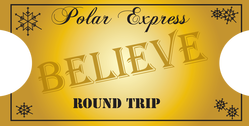
Polar Express
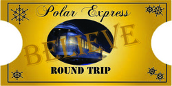
Our latest assignment was to design a ticket for the Polar Express for a local elementary school. I was assigned to do the back of the ticket which had to include the text: "Polar Express", "Believe", and "Round Trip." The ticket also had to have an image involving Polar Express and Christmas effects. I decided to first start with a gold gradient background, to give the ticket the authentic feel of the tickets from the movie. I then decided to take an image of the train and filter it to look drawn, and more child-ish. After editing my photo and making an oval clipping mask, I found different fonts from Dafont.com , I chose Chopin_Script to write the Polar Express text. I then looked through Adobe Illustrator and found a font I liked for the Round trip, and the same for the Believe. I decided to change the transperancy of the Believe, to create a lighter look for it, and so that you could still see the ticket. To add some Christmas flair, I created my own snowflakes from different shapes and lines in Illustrator. This project was fairly quick and easy, but I did find that I needed to learn how to download brushes and fonts. The photo below is the version of my ticket that was used for the back of the ticket made for the elementary school
Roy Lichtenstein
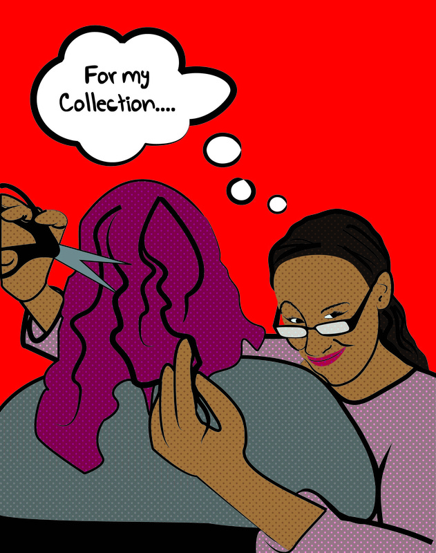
Our latest assignment was a look at Roy Lichtenstein's artwork. His artwork came from the fact that ink cost too much to print so he developed this cheaper way of creating paintings by using little dots called "Ben-Day+ dots. The amount of space between the dots will determine the shade of the color used. To do this Roy Lichtenstein portrait I started by taking a picture with Sarah of me pretending to cut her hair. I then re-sized the photo in Photoshop, the next for this portrait was sending it to Illustrator. In Illustrator I had already organized and created the different layers I would use for this project. After separating the layers I traced the outlines of the picture with a black stroke, for the stroke I chose an artistic ink brush, from the Illustrator brushes libraries. After everything was outlined from my face, to eyes, to Sarah's shirt I began to create my own swatch of Ben-day dots.
To make the dots I had to zoom in a the grid and use the small squares there. I placed same sized circles on each corner. I then made two same size rectangle, one had no swatch or stroke- this was sent to the back of the circles. I then grouped all the shapes, scaled them down to 15%, and then created my own swatch. I filled the appropriate outlines with the right colors. Eventually everything was outlined and colored. After re-adjusting a few things, correcting some outlines, and adding a funny (romantic) caption my masterpiece was complete.
To make the dots I had to zoom in a the grid and use the small squares there. I placed same sized circles on each corner. I then made two same size rectangle, one had no swatch or stroke- this was sent to the back of the circles. I then grouped all the shapes, scaled them down to 15%, and then created my own swatch. I filled the appropriate outlines with the right colors. Eventually everything was outlined and colored. After re-adjusting a few things, correcting some outlines, and adding a funny (romantic) caption my masterpiece was complete.
