Who wants pizza?
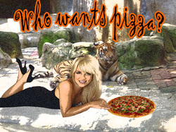
Our first assignment of the year was to tour through photoshop as a refresher course. We started with thee photos : a zoo, Britney, and a pizza. The zoo was our background, then we added the pizza layer. Using tools like the magic wand, perspective, clone tool, and zoom we were able to create this photo. After finishing the photo we added text and some elements like shadow to the text. The last element of the photo was an artistic film grain filter.
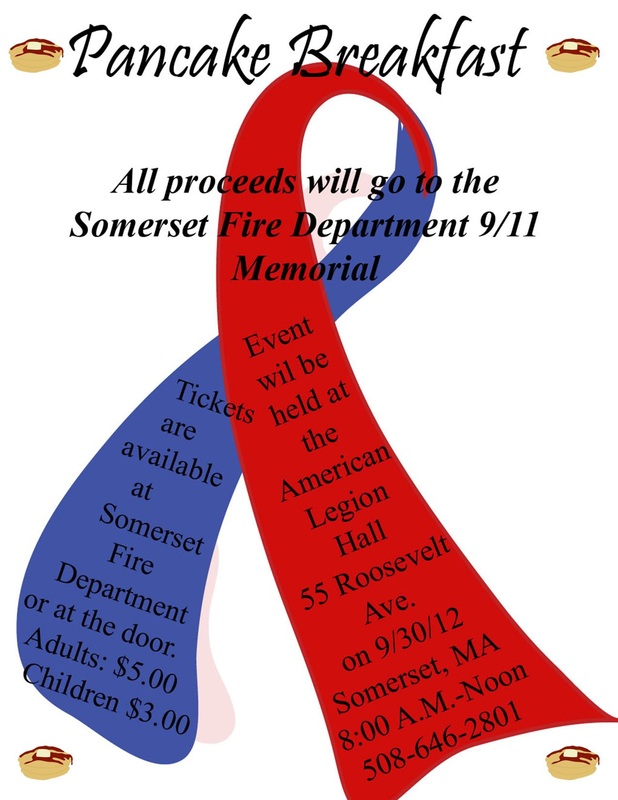
Pancake Breakfast
For the Somerset Fire Department 9/11 Memorial they are having a pancake breakfast to raise funds. For this we were asked to makea flyer to advertise the event. I used publisher to make a 9/11 ribbon. Using the layers in Illustrator and other tools, i created teh ribbon. Then in Publisher and Photoshop i warped the text into the ribbon. I also used Illustrator to make my own pancakes to add a little more detail into my picture.
Logo Development 1
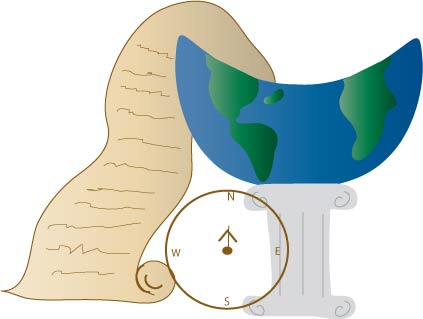
Our assignment now is to create a logo for certain departments in the school. I decided to do my first one for the history department. To start I brainstormed things that reminded of what is taught in history. I thought of: wars, countries, stories, Medieval times, books, soldiers, geography, and discoveries. I thought of pictures that represent all of these things, after doing this I drew an image. I scanned the picture on the computer and using Adobe Illustrator I started to develop the logo. I used tools like layers, swatches, the ellipse, the warped tool, and other techniques like the pen tool.
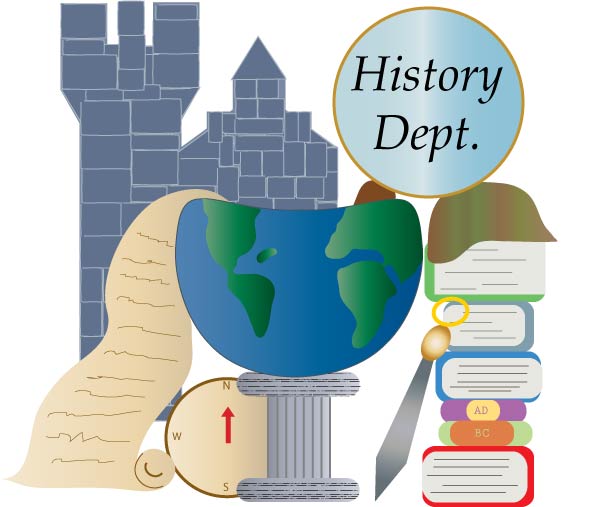
Logo Development 2
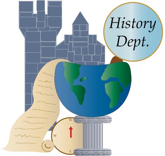
This is my second stage of development of my history department logo. I have added a castle and a magnifying glass to the logo. Along with adding this elements I added texture and gradients to the pedestal to give it a 3-D look, that the rest of the elements have. Using layers has helped me keep the work organized. To make the castle I combined shapes to create the tower and point of the castle, instead of drawing it freely with the pencil tool. I also used the Direct selection tool to adjust certain points of the shapes, to create what I wanted. I still have more to work on the piece. I want to edit the castle to make it look more realistic, and so it can pop like the rest of the pieces.
Logo Development 3
My piece now has all of the elements of my design. But I am very concerned in the look of the castle. I want it to have that brick-look, but right now it seems to be too much. I will have to work to try to figure out how to improve the castle. Since my second development I have added the stack of books into the logo, and a helmet. To create the books, I overlapped two round-edged rectangles and made one rectangle a book paeg color, while the other is a book binding color. By overlapping the shapes I made an easy way to create books. To make the helmet I used the pencil tool to draw my own, and with the direct-selection tool I fixed the shape to be exactly what I wanted.
Final Logo Development
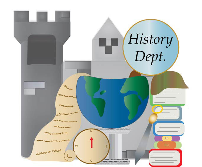
This is my finished piece of my history department logo. To finish the logo, I fixed the castle. I changed the castle by adding a gradient overlay this added depth to the castle. I then added a few squares and lines to create the brick look of a castle without over doing the effect. Other changes I made to the piece, was adding real writing in the scroll. I chose to use famous quotes from history that are from different times period, for example a few of the quotes are " Give me liberty, or give me death", "I had a dream", and " A day in infamy". Other revisions I made to the piece was fixing the layering of the books. In my previous development the blue middle book was not layered on the purple book correctly. To fix this minor issue i just reorganized my layers panel. Another change I made was to the pedestal, I changed the order of the colors on the pedestal to give it a rounded look. After using layers, pen tool, pencil, swatches, free transform, and various other tools in Illustrator I completed this logo.
