Logo Evolution Garnell Industries
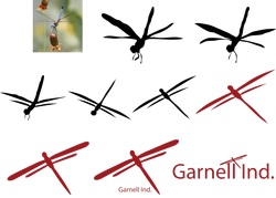
For this lesson we began to study about logos and the evolution of them. We were given a story about Garnell and how he became an inventor, the story ended with "think bug". So my idea was a dragon fly, because in the story Garnell mentions how he wanted to something that would make a plane fly and turn faster. One of the faster flying bugs I could think of was a Dragon-fly. So I began with a picture template of a dragon fly, from there i traced the bug with a black silhoutte. Then I lessened the photo and made it more simpler. Each time I went back and made the silhoutte I made sure the logo had symmetrical parts and each piece was smooth. Once I got the logo to be simple enough, i changed the color, because in the story Garnell mentioned how he loved his dog "Rosebud". So I changed the logo from black to red. I finished the project by adding the company name to the logo in a stylish manner.
Movie Research Project
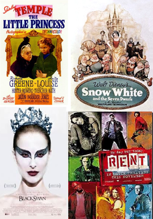
Throughout history images, design, and entertainment have been used to communicate with people. Movies became a huge part of culture, and to communicate this new form of entertainment to the people businesses would use movie posters to attract fans. There are many different elements that go into making a movie poster, there are also numerous: styles, techniques, and themes. Shirley Temple: The Little Princess, Snow White: and the Seven Dwarfs, The Black Swan, and Rent are several movies with posters that greatly show the dynamics of movie posters.
In 1937 Snow White and the Seven Dwarfs was introduced to theatres. The poster that advertised this film was a scenery of the film with the movie’s characters and a badge that featured the Company, the movie title, and the new features the movie had- Technicolor. The characters on the poster were Snow White, the dwarfs, some animals, the Prince, and the witch(queen). Snow White is present on the ad , because she is the main character and the whole movie is about her and finding her prince charming and safety. The dwarfs also found a spot on the poster, because the movie takes place in their home and is based on their relationship with Snow White. The Queen and witch are also very important to the story, because she is the ultimate villain of the movie, and brings the conflict. The prince can also be considered significant, because he in the end is the true hero of the film. The colors of the poster are muted reds, blues, oranges, greens, whites(pales), blacks, grays, and tones of brown. The colors were probably used, to show off the new invention of color in films. During this time the colors were limited so that is probably why the colors are dull and muted. The basic shape of the ad is a rounded, a similar to a cylinder, because of the badge where the font is. When looking at this eyes are attracted to the bottom towards the font and to Snow White’s light dress. Overall this was a quality poster for this time period.
In 1939 Shirley Temple: The Little Princess was released to the public. The overall design of the poster is the title, a scene from the movie surrounded by curtains, and then the film credentials. The characters featured on the poster are Shirley Temple and the Queen. Shirley is important, because she is the main character, the little princess, the whole movie is about her and her life without her father while he is at war. The queen is also on the cover, because at the end of the movie she gives Shirley a solution to her problem. The scene on the poster is from the end of the movie when Shirley is trying to find her dad and to leave the school she is attending, this leads her to meet the Queen. The majority of colors on the poster are yellow, green, and black. Other colors are used to display the new Technicolor and pink is used to attract girl fans to watch the movie. Yellow is used throughout the poster to attract the eyes to the scene and the font. The overall shape of the poster is rectangular , and has curtains to open the eyes to the scene. The eye is very attracted to the yellow rectangle in the bottom of the poster where the font is placed. The font can also be located at the bottom and corners of the poster. Over time though poster have begun to look much different than in the 30’s.
The musical Rent came out in 2005, and is based on the Broadway hit. The cover of the film is a collage of all the characters portrait and each with a different background color. And the text is located in the right center of the poster. The characters featured on the poster are Mimi, Collins, Angel, Mark, Bennie, Maureen, Joanne, and Roger. Mark is one of the more important, because he is arrogating and documenting the whole story. Roger is also a main character, because he is Mark’s best friend and invited love and disease into the story plot. Angel is the other important character, he is the uniting force among all the characters and after his death he effects each one greatly. The colors of the poster seem to be dirty or gravelly. The colors shown are red, purple, orange, green, blue, and yellow. So many colors where used because it implies the message that everyone is different and no two people, or colors, are the same. Each color square has a different character and the characters, are some what placed near their lovers in the film. The shape of this ad is just a square collage of pictures. To attract the public to view the poster the striking colors and bright white font capture the eye. The order of the text is a song from the movie, the title, the opening date, and the film credentials.
Another more recent film was the Black Swan in 2010 this striking and dramatic movie had a poster that was equally dramatic. The only character on the poster is Nina Sayers, a ballet dancer who is struggling to maintain her grip on reality and herself. Nina is important, because she is the main character and the plot revolves around her change from Odette to the black swan. The colors of the poster are mostly black and white, and the whole piece has a grayscale feel. Her dark red lips and the white background show the contrast in the movie between the two swans, the two dancers, and Nina and the swan. The contrast colors also look very dramatic like the movie. The whole poster is taken up by the portrait of Nina. She is the main element of the poster and the eye is drawn to her facial features and the shadow below her neck bring the eyes down to the font, the title. Some font are placed around the portrait but most are on the bottom and center of the poster. The title sticks out because it is bolder than the other font and is capitalized. The font on the poster goes the opening dates, actors, the title, and credentials. This poster varies very much from the other ones before it.
All of the previous posters are very different from each other, but if looked at closely there are some similar elements between them. Shirley Temple and Rent both use many colors, but one is used to promote a new technique while the other is to convey an artistic message. Snow White and The Black Swan do not have as much color, because one did not the resources to be colorful and one movie wanted to make a visual statement. One similarity between the four movies is that all of the titles are not the first text one the poster. Some titles followed a quote, one a name of a company or actor, and one information. The evolution of the design of movie posters shows that at first most posters were literal and scenes from the movie, while today posters are more dramatic and artistic. But in a few years the design of movie posters might change from being dramatic to something else.
Movie Posters
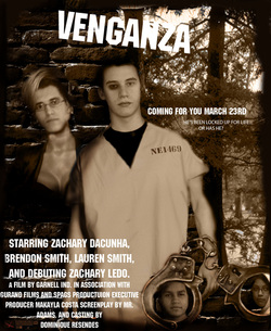
Our latest project was to design a movie poster for a film about life in a South American prison. The story plot of my movie Venganza, Revenge, isabout the main character, Zachary Decunha, who is in prison because a borther siser, pair of criminals has him arrested for a crime he commits. The movie revolves around how Zach and his girlfriend Zachary Ledo are trying to get revenge on the pair. The movie setting is the prison and a South American swamp, where the pair is hiding from the Zacks. To design this poster I started with a 18x22in page where I made the brick wall the background. Then I found a swamp to split the page in halves, and to add another element into the design. i then had to find bodies of a criminal and a woman, to clone the faces of my actors in. The clone tool was used to add the faces into the handcuffs, and handcuffs onto the main design over the main character's body. Once the characters were on the design I used color replacement to create a sephia looking tint to the deisgn. This made look more criminal-ish. It helped set a tone for this type of movie. The text on the poster, includes the title, release date, the actors, and all credentials to the main people who "worked" on the film. I also included my previously made logo, to be the producers of my film. The burn tool also helped me add soem effects to the poster: shadows on people's faces, blurring the pictures more into the scene, darkening the edges of the poster, and adding effects the their faces ( like a black eye) . Overrall my poster tries to advertise a great prison move to the public.
Bullying: Knights of Pythias. Be a Friend Not a Bully
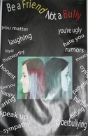
One of our latest assignments was to design a poster for the Knights of Pythias. The theme of the poster was "Be a Friend Not a Bully." For my poster I wanted to something more dramatic and bold. On one side of my design i have things a friend would say and do, and how a being a friend makes you feel and others. This side of the design also has a portrait of a girl smiling. The other side of the design is the feeling, words, and actions of a bully. This side of the design also has a frowning face, to portray the way bullying makes a person feel. Hopefully my poster is successful in this competion. I used the pen tool make paths for the words this made me able to control wich direction the words were written. Using photoshop i was at o create the different profiles for the portrairs. I experienced with layers to make mmy works easier and organized.
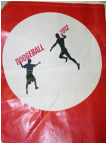
Dodgeball Tournament t-shirts 2012.
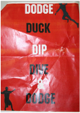
For the dodgeball tournament at school we were asked to make t-shirt designs fr a red shirt. We had to design something for the t-shirt back and the pocket. My design was made in Illustrator and I created silhouettes of two boys throwing dodge balls at eachother. The figures are in an outline of a dodge ball and are throwing the word s"Dodgeball 2012" at eachother. On the back I used a certain font to write out the quote from the movie Dodgeball the 5 D's of dodgeball " Dodge, duck, dip, dive, and Dodge." Along with the quotes i included more silhouettes throwing doddgballs at eachother around the words.
Career Decision-Making System Revised
In class we took a test that would help us choose a career. The test is based off were you stand in the followeing categories: social, artistic, scientific, crafts, and business. You describe skills, interests, and the kind of environment you want to work in. Based off these questions you can figure out where you would work best, what job would make you the most happy, and give you what you want. I received my highest scores in art and social, and the top job that I got was a music teacher. But that was not what was i was planning. So the test was not that compatible with my future plans. I do not know anythign about music, nor do I want to be a teacher. I want to be a Graphic designer so it makes sense that I tested high in the arts area.
